Tuesday, November 29, 2011

Parkhill, Smith & Cooper

The materials used and the construction of spaces have endless possibilities in what they can become and represent. But along with these never-ending opportunities there are multiple forums for which to create those wide-ranging and unique places. Lubbock, Texas offers its own division of Parkhill, Smith and Cooper Inc. to fill that void. Parkhill, Smith and Cooper, also referred to as PSC, is a firm specializing in all aspects of building, from engineering, architecture, interiors, to landscape. All of these vocations coming together in a unified working space to pool their talents and create new modern architecture that remains environmentally sensitive with specific focus on LEED qualifications.
LEED is the main component of PSC, or at least what they pride themselves on the most and what they strive for in every project.  LEED stands for Leadership in Energy and Environmental Design, through a series of checks and points it awards certification based upon a company’s ability to produce in a way that is better for the world surrounding us. As we walked around the offices of PSC in Lubbock we saw this concept put into action. Not only did the offices incorporate efficient technology but the actual materials used in each room design and construction reflected environment awareness. Throughout the building there was even small clean labeling of new products as the appeared stating the content of the material and is recyclability.  
Recyclability was taken to a whole other level in their personal office design in more ways than one. As our class’ tour continued we learned about the buildings unique roofing structure. The roof was constructed as a garden almost; with low-lying plants and their soil making up the roof components.  This led to a greater idea, the parking lot is slated in a way to control water flow, but not only is it slated but the actual parking spaces in the lot are a majority of grass with concrete in place only for the tires.  This they explained allowed the draining water to be filtered before reaching the drainage system. And it goes even further, once the water reaches the drainage system it is reused to water the plants on the roof, and the process repeats itself.
In addition to all of this, Parkhill, Smith, and Cooper not only uses recycled products but they maintain a standard of time saving work ethic. They have their differently skilled employees all inter mingled with private offices separated by a thin frosted glass, opening up the space and pushing for collaboration in everything ensuring efficiency and quality. They keep up with the individual cubicles and provide common work spaces with plenty of storage, natural and artificial lighting, along with warm and inviting social break rooms.
Altogether, the offices of PSC stand as an example to a truly environmentally friendly company; adherent to the highest LEED standards and so much more; making sure to create both aesthetically pleasing and stable products in all different revenues while supplying an ideal work atmosphere.
Tuesday, November 15, 2011

Jeff Seals: Homes of Distinction

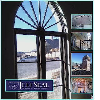
This past Tuesday our small interior design class jumped in our cars and drove across town to see some of Lubbock’s own residential architecture designed by Jeff Seal. It was amazing to witness real architecture design combined with interior design being put into reality. We had the privilege of seeing a building nearing completion and another that was still in the framing stage. Both of them however, allowed us as students, to see the many aspects and differences our field of work allows. Jeff seals sidekick, or assistant, happens to be a Texas Tech graduate from the same interior design program all of us are currently enrolled in. Getting a chance to see her work, combined with the work and expertise of Jeff Seal first hand, really inspired me personally, and restored my initiative to create and design in more ways than one.
To begin with the first house that we visited was located in a gated higher-end community of Lubbock, upon entering the neighborhood one was surprised at the grandeur and scale of most of the surrounding homes. The community, and Seal’s house in particular was inspired by Provence, France. This design concept then lent itself to every aspect of the home. Jeff Seal with the guidance and ideas from his interior designer, made the interior and exterior of the home genuine. From the shaping of the entryways, ceilings, and windows with their curved and flourished arches to the types of raw materials used in construction such as the mix-matched stone and brick; the detailing on the curving stair rail, the rustic light fixtures, and the antiqued cabinetry, all of it transporting the viewer to another era in France. And yet all of the authenticity of the building and that atmosphere was kept while still incorporating the latest technologies. There were bathrooms with heated floors, the newest appliances in the open kitchen, and so on. Even the outside was customized, a aged stucco with curved iron rod balcony, a bricked pointed chimney, the scalloped edges, down to the one-of-a-kind carved French doors leading into the house, which by the way were hand drawn by Seal’s assistant designer.
From there we visited the second house, and while it was still lacking the detail of the other home, the framing of this structure spoke for itself. Walking under the support beams for the entryway, our eyes widened at the greatness of the space. One walks directly into a open foyer with two curving staircases on opposing sides leading up to the second floor, and this foyer is capped off with a beautiful dome, much like the ones that we have been studying in another required course. From there explored the laid out rooms, a grand piano room surrounded by a balcony from the second floor, two master suites, an office, and even a small room just for the family’s dog. The size of the space was incredible and due to its incompletion allowed us as future interior designers to design the interior in our minds. We could see the black and white marble floors, the golden chandelier, and so much more. It amazed be though, how much detail and effort goes into even the framing of a house, before the fun stuff like textures are applied.
As we finished our tour and drove away, I sat there very excited because I held a new excitement for what I was learning. I was able to see every classroom lecture applied in real life, from domes and barrel vaults to stone variations and then its actual success and beauty in a home. Jeff Seal and his Texas Tech interior designer did an incredible job capturing Provence, France, and stimulating our group.   

Tuesday, November 8, 2011

Collin's Tile and Stone

                On our latest field trip, we as a thriving fabric and materials class visited Lubbock's own local stone showroom, known as, Collin's tile and stone. While there we saw all aspects of the tile business, from the multiple types of raw stone to the actual finished product, ready to be placed into a space. It really allowed us as students, to see behind the scenes of our average everyday counters and floors. There is so much possibility and options in stone application on both residential and commercial spaces, and all of this was revealed as we stepped inside.
                Our host for the trip was Mr. Collins himself. He welcomed us into his showroom where we were greeted with displays boasting an array of tiles and stones in every category, made in every shape, size, and color. We spent the first half of the visit discussing the composition and styles of the featured stone pieces. The walls were lined with shelves. The top shelf held large slabs of your standard most typical granite, with the majority being neutrally colored.  from there it went on with more smaller sized tiles in even more outstanding variety.  We discussed the elements and components of each, talking about their individual durability, resistance, and best usage. From there we discussed specific and specialized stone, which led us outside.
                To the side of their actual showroom, Collin's keeps slab upon slab of raw rock. The majority was granite coming from different extracting companies. We discussed the pricing of the granite, touching on how the originality and uniqueness of a slab determined its cost. One slab that was pulled out from the rest was a blue hued granite, with almost metallic looking veins. Its individuality made it absolutely breath taking and also made it cost a small fortune. Along with the granite there was, travertine, and stone whose texture was provide through small shell fossils that remained in the rock. The large amount of stock that was hidden outside only went to prove again stone's limitless possibilities.
                Possibilities not only in make-up but in manufactured design. From the outside lot we returned inside, only this time coming into the actual workroom. There several men were working to make finished countertops and tiles. Some were cutting out rough estimates of size, others operated a large extensive piece of machinery that took a coded plan previously designed and actually carved the stone into its desired shape. From there the pieces were manually touched up. And then the edge was adjusted, usually curved or scalloped. From there they were cleaned up and ready for installation.
                 Collin's Tile and Stone really allowed for us to see the full and complete range of all that is involved with stone. The knowledge required and vase amount of material one must be comfortable with. It was a lot to take in, the types, styles, and colors to the process of preparing the stone. But all of it inspired the artist within to explore and challenge everyday concepts and materials to make a home more than just a typical house. 

Thursday, November 3, 2011

Leftwich Chapman Flooring

I had the opportunity to visit a small local store here in downtown Lubbock, Texas named Leftwich Chapman Flooring, owned and operated by two partners Mr. Leftwich and Mrs. Chapman. These two have worked together for the majority of their adult careers and are now paired up together in running a successful flooring showroom. The showroom, organized by material, offered a seemingly endless supply, of hardwood floor, carpet, and tile varieties. With this introductory information the tour commenced.
The tour began in a corner that offered both artificial and natural light with a floor that showcased at least six or seven hardwood floor options. While standing in this section of the store, we were shown and educated in the multiple floors that were on display. Leftwich Chapman Flooring makes approximately seventy percent of its net profit from the sale of hardwood floors. This large percentage could be based on the variety they offer.  We were shown authentic natural wood floors; some hand-scraped, cross scraped, heat warped, and or buffered smooth. We saw some floors that while the base was still original hardwood, they were innovated with a more unique top appliqués, such as finished leather or even a bamboo floor. We learned that the industry of wood flooring has shifted from an average solid plank of wood being nailed to the hard floor, to the thinning and cross layering of wood, to allow for easier glue application and better durability.  Leftwich also went into the basis of pricing, he compared his selection to franchises such as Home Depot, explaining that while they are cheaper usually the under layers of wood are not the strong oak or hickory but rather an imported chit wood or other softer wood making them much more susceptible to damage. He also went into to describe how the cost of his hardwood could vary from twenty dollars a square yard to more than eighty a square yard. He explained that one also had to take into account the cost of installation, which could change depending on what was previously in the space, if that needs to be removed, so on and so forth.
From there we went on to see their fine carpeting selections. We went on to hear about the major companies in the industry of carpeting and the textiles that they offer. He went on to discuss the construction of carpet making sure that all of us knew that carpet is made with a nylon majority. However, it is not the only material that can be used, as the make-up of the carpet depends on the feel and look desired. There were some carpets that were over the top and, very thick and fluffy with looser strands used more for rug coverage, there were carpets that were more commercial with a tighter weave and shorter more coarse strands. He introduced us to a current design fad of patterned carpets. Carpets that are either patterned by through dye with color or line variation, or carpets that express design through texture, with “burnt out” portions in the fabric.
                After exploring the carpet displays, we went to the far right of the store and looked at something that held a little more personality, tile. He had tiles from all the major companies including Daltile and others. Leftwich had large slabs of granite for large overall coverage in a variety of more neutral tones. He also offered your standard tiles that you could find in any hardware store, but what really interested me were the smaller more detailed mosaic tile concepts. There was mosaic tile like small rounded rocks from the bed of a lake, or metal tile created to look like pennies of nickels. There was typical glass tile, but some had been cut so small it was flexible and could be curved and manipulated. Some tile squares were full of glitz and glam, with glitter or silver inlays. It was astounding to see the immense amount of differences in the entire presented tile.
All in all, the trip was incredible and opened my mind to the endless amount of design possibilities that you are given as an educated interior designer. No one room has to be alike, that there are materials and resources out there to make each and every room or space completely unique, from the hardwood and carpeted floors, to the tile chosen for ones kitchen or bath.