Sunday, December 11, 2011

Interior Materials: Red to Black Final

Red to Black Floor Plan
Solution Statement:
                In the development of Texas Tech’s Red to Black project every detail was planned to ensure the comfort and privacy of every student that needs serious financial help. Each space was designed to replicate the atmosphere of a home den room and the materials selected allow for that. The paint, wood, carpet and fabrics chosen all lend themselves to the idea of safety at home. Not only do these materials create an aesthetically pleasing environment, but they offer strong sustainable materials for a long lasting space at an economical cost. 


Materials & Calculations:
               
       Wall Paint:
Company: Behr
Product number: UL110-6, UL140-1, UL140-14
Color number: Indiscreet, French Roast, Heavy Cream
Species: Premium Plus Ultra
Form: Liquid filled container
Size: 1 gallon
Gloss Level: Semi-Gloss
Space Used: Reception, Conference & Office
Sustainability:
Lead-Free
100% Acrylic Latex
Added Mildewcides
NANOGAURD Technology
Installation:
Tape of surrounding areas.
Applied by brush or roller.
Maintenance:
Regularly wipe down with non-abrasive cleaner such as soapy water.
Touch up marks, scratches, and nicks with matching paint. 
Calculations:
                Cost: $33.98 per gallon.
                    Add all wall lengths:  36 + 24 + 24 + 12 + 12 +
                    12 + 8 + 8 = 136
                    Multiply by height:  136 x 8= 1,088
                    1,088/ 380 (sq. ft. per gallon) 
                    Need 3.1 paint containers = 4 containers
                    4 containers at $33.98 each: 4 x 33.98 = $13


      Wood Ceilings:

         Company: Armstrong
Product number: 1274
Color number: Rich Cherry
Species: WoodHaven
Form: Plank
Size: 84" x 5" x 3/8"
Finish: Laminate
Edge Detail/End: Beveled Tongue & Groove
Space Used: Reception, Conference, & Office
Sustainability:
BioBlock Treatment
Extra durable scratch and impact resistant surface.
10 year warranty.
Installation:
Construction adhesive.
Maintenance:
Dust and loose dirt removed by brushing or with a vacuum cleaner and vacuum cleaner attachments such as those designed for cleaning upholstery.
Clean in one direction only. This will prevent rubbing dust into the surface of the ceiling.
Pencil marks, smudges, or clinging dirt may easily be erased with an ordinary art gum eraser or soapy water.
Calculations:
                Cost:  $93.15 (10 pieces/ 29.7 sq. ft.)
Total sq. ft. divided by sq. ft. of 1 order: 864/ 29.7 = 29.1
Need 29.1 sets = 30 sets
30 sets at $93.15 each = 30 x 93.15 = $ 2,794.50
 

Shelving/Counters:
Company: Home Depot
Product number: 165956
Store SKU: 165956
Color: Stained Dark Cherry
Construction: Layered Veneer Red Oak Domestic Plywood
¾” x 4’ x 8’
MFG Model: 165956
MFG Part: 165956
Space Used: Reception, Conference, & Office.                  

                    Sustainability:
The plywood will be used in the construction of the floor to ceiling shelving and coffee bar tabletops. It will be installed with wood adhesives and standard nails. 
100% Recyclable
All natural wood
Soy-based PureBond formaldehyde free assembly
                    Installation:
The plywood will be used in the construction of the floor to ceiling shelving and coffee bar tabletops. It will be installed with wood adhesives and standard nails.
                    Maintenance:
                                    Dust as needed.
Occasionally wipe down with non-abrasive solution,
soapy water or Pledge products.
                    Calculations:
                              Cost: $44.97 per board.
(6) 4’ x 8’ x 1’
(24) 4’ x 1’
(2) 10’ x 2’
Need 25 boards to create these pieces.
25 at $44.97 per board: 25 x 44.97 = $1,124.25
               

Carpet:
Company: Shaw
Product number: Sanctuary 60163
Color number: Wheat 00201
Collection: Colour of Life II
Construction: Solid Cut Pile
Product Type: Performance Broadloom
Dye Method: 100% piece dyed
Fiber: BCF Nylon
Backing: Synthetic & Classicbac
Tufted Weight: 29.3
Warranty: 10 year limited commercial
Space Used: Reception, Conference & Office
                   Sustainability:
                                   Green Label Plus Certification
                                   10 year warranty
                                   LEED Certification
                                   Evergreen nylon recycling facility takes back old 
                                   carpet for recycling                         
                    Installation: 
                                   Direct glue on all concrete flooring.
                    Maintenance:
                                   Cleaning through regular vacuuming and 
                                   occasional steam cleaning.
                    Calculations:
                                   Cost: $33.00 per sq. yd.
                                         Total sq. ft. with additional 10% extra:
                                         864 + 86.4 = 950. 4 sq. ft.
                                         Divided to get sq. yds.: 
                                         950.4/ 9 = 105.6 sq. yds. = 106 sq. yds.
                                         106 sq. yd. at $33.00 per sq. yd. 
                                         = 106 x 33 = $3, 498
               

          Chair Fabric:
   Company: La-Z-Boy
   Product number: 931
   Color: Raisin B974509
   Product: Charlotte High Leg Recliner
   Used In: Reception & Conference Room
                      Sustainability:
                                 Limited Lifetime Warranty
                                 Natural Wood
                                 100%  Recyclable fabric
                      Installation:
                                  Custom upholstery done by manufacturer.
                      Maintenance:
                                  Occasionally vacuum to remove dirt, dust and lint.
                                  Professional cleaner to remove stains.
                      Calculations:
                                  Cost: $13.95 per yard.
                                              Chair requires 5 yard:
                                              5 x 13.95 = $69.75
                                              $69.75 a chair with 6 chairs: 
                                              6 x 69.75 = $418.50


                Couch Chair:
            Company: Custom from Fabrics.com
            Product & Color number: UL-089
            Color: Ostrich Wine
            Collection: Faux Leather Ostrich Wine
            Fiber: 100% Vinyl
            Backing: Flannel
            Weight: Heavyweight
            Used In: Conference Room & Office
                                Sustainability:
                                                Stain and Fire Resistant.
                                                Long life expectancy.
                                Installation:
            Custom couch upholstered by local professional 
            upholsterer using fabric glue and fabric bolts.
                                Maintenance:
                                                Regular wipe down with damp cloth.
                                Calculations:
                                                Cost: $ 12.98 per yard.
                                                           Couch requires 30 yards of fabric
                                                           at $12.98 per yard:
           30 x 12.98 = $398. 40
           $398.40 a couch with 3 couches:
           3 x 398.40 = $ 1.195. 20


Tuesday, December 6, 2011

Interior Materials: What I Learned Fall 2011

I have learned a lot through the Interior Materials class offered here at Texas Tech. As the year draws to a close I wanted to take a little time to look back at everything this class has covered and the information I have obtained. We started off learning about fibers in their natural form and are ending with the details and components of LEED certification in a finished and established structure.
This transition through all the aspects of design materials has proven to be quite interesting. In August we began looking at the variety of fibers. We discussed natural versus manmade fibers, and staple versus filament fibers. We talked about the positives and negatives of all the different fiber sources, such as natural cotton, linen, wool, or synthetics, like polyester and nylon. Learning things such facts that nylon is the main component of most carpets. We got o witness firsthand the making of actual cloth from fibers at the Fiber and Biopolymer Research Institute. From fibers, we went on to discuss the coloring of cloth. Whether and in what situation it would be most convenient to stock dye or piece dye. Then fabric got much more complicated as we studied the design, textures, and weaves of each. I am now able to look at a fabric sample and tell you that it is in fact a jacquard weave with a tossed pillar print. We were exposed to all these prints and textile options at Lubbock’s quaint shop, All About Looks. After, studying the fabric types, our class discovered finishes that would enhance the chosen fabrics. And with these specific finishes how it could effect and determine the use of that particular fabric.
Once we were very thoroughly trained in the ways of fabric, we began to explore other materials. We spent a little class time searching for unusual materials that are not commonly used, such as, newspapers, old recycled street signs, water bottles, tires, and so much more. Form there we went on to see more commonly used products like wood flooring, stone, and tile. Until we had visited both, Collins Tile and Stone, and Leftwich Chapman Flooring, I had no idea that the industry had so many options to offer. There are literally countless possibilities for flooring in both commercial and residential spaces. We saw things like, treated leather floors, bamboo floors, blue granite, countertop stone still containing shell imprints and particles, and countless other materials.
During the later end of this class, we were able to learn how to take these amazing materials and turn them into an aesthetically pleasing space.  We reviewed the elements and principles of design that should be incorporated into every building and every room to make it a design success.  Then we saw examples of this success, through Jeff Seal’s Homes of Distinction. His use of all the materials mentioned throughout the class, with the exception of finishing touches, really made it obvious the importance of knowing and then choosing the correct materials for each project. When creating a home to replicate the style of the French Provence, he knew what materials and finishes would complete the space and make every aspect authentic.  It was really through this experience, in a real world situation, that I realized that all of the information I had learned over the course of the semester really was beneficial and crucial to becoming a successful and established interior designer.

Tuesday, November 29, 2011

Parkhill, Smith & Cooper

The materials used and the construction of spaces have endless possibilities in what they can become and represent. But along with these never-ending opportunities there are multiple forums for which to create those wide-ranging and unique places. Lubbock, Texas offers its own division of Parkhill, Smith and Cooper Inc. to fill that void. Parkhill, Smith and Cooper, also referred to as PSC, is a firm specializing in all aspects of building, from engineering, architecture, interiors, to landscape. All of these vocations coming together in a unified working space to pool their talents and create new modern architecture that remains environmentally sensitive with specific focus on LEED qualifications.
LEED is the main component of PSC, or at least what they pride themselves on the most and what they strive for in every project.  LEED stands for Leadership in Energy and Environmental Design, through a series of checks and points it awards certification based upon a company’s ability to produce in a way that is better for the world surrounding us. As we walked around the offices of PSC in Lubbock we saw this concept put into action. Not only did the offices incorporate efficient technology but the actual materials used in each room design and construction reflected environment awareness. Throughout the building there was even small clean labeling of new products as the appeared stating the content of the material and is recyclability.  
Recyclability was taken to a whole other level in their personal office design in more ways than one. As our class’ tour continued we learned about the buildings unique roofing structure. The roof was constructed as a garden almost; with low-lying plants and their soil making up the roof components.  This led to a greater idea, the parking lot is slated in a way to control water flow, but not only is it slated but the actual parking spaces in the lot are a majority of grass with concrete in place only for the tires.  This they explained allowed the draining water to be filtered before reaching the drainage system. And it goes even further, once the water reaches the drainage system it is reused to water the plants on the roof, and the process repeats itself.
In addition to all of this, Parkhill, Smith, and Cooper not only uses recycled products but they maintain a standard of time saving work ethic. They have their differently skilled employees all inter mingled with private offices separated by a thin frosted glass, opening up the space and pushing for collaboration in everything ensuring efficiency and quality. They keep up with the individual cubicles and provide common work spaces with plenty of storage, natural and artificial lighting, along with warm and inviting social break rooms.
Altogether, the offices of PSC stand as an example to a truly environmentally friendly company; adherent to the highest LEED standards and so much more; making sure to create both aesthetically pleasing and stable products in all different revenues while supplying an ideal work atmosphere.

Tuesday, November 15, 2011

Jeff Seals: Homes of Distinction

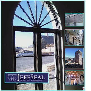
This past Tuesday our small interior design class jumped in our cars and drove across town to see some of Lubbock’s own residential architecture designed by Jeff Seal. It was amazing to witness real architecture design combined with interior design being put into reality. We had the privilege of seeing a building nearing completion and another that was still in the framing stage. Both of them however, allowed us as students, to see the many aspects and differences our field of work allows. Jeff seals sidekick, or assistant, happens to be a Texas Tech graduate from the same interior design program all of us are currently enrolled in. Getting a chance to see her work, combined with the work and expertise of Jeff Seal first hand, really inspired me personally, and restored my initiative to create and design in more ways than one.
To begin with the first house that we visited was located in a gated higher-end community of Lubbock, upon entering the neighborhood one was surprised at the grandeur and scale of most of the surrounding homes. The community, and Seal’s house in particular was inspired by Provence, France. This design concept then lent itself to every aspect of the home. Jeff Seal with the guidance and ideas from his interior designer, made the interior and exterior of the home genuine. From the shaping of the entryways, ceilings, and windows with their curved and flourished arches to the types of raw materials used in construction such as the mix-matched stone and brick; the detailing on the curving stair rail, the rustic light fixtures, and the antiqued cabinetry, all of it transporting the viewer to another era in France. And yet all of the authenticity of the building and that atmosphere was kept while still incorporating the latest technologies. There were bathrooms with heated floors, the newest appliances in the open kitchen, and so on. Even the outside was customized, a aged stucco with curved iron rod balcony, a bricked pointed chimney, the scalloped edges, down to the one-of-a-kind carved French doors leading into the house, which by the way were hand drawn by Seal’s assistant designer.
From there we visited the second house, and while it was still lacking the detail of the other home, the framing of this structure spoke for itself. Walking under the support beams for the entryway, our eyes widened at the greatness of the space. One walks directly into a open foyer with two curving staircases on opposing sides leading up to the second floor, and this foyer is capped off with a beautiful dome, much like the ones that we have been studying in another required course. From there explored the laid out rooms, a grand piano room surrounded by a balcony from the second floor, two master suites, an office, and even a small room just for the family’s dog. The size of the space was incredible and due to its incompletion allowed us as future interior designers to design the interior in our minds. We could see the black and white marble floors, the golden chandelier, and so much more. It amazed be though, how much detail and effort goes into even the framing of a house, before the fun stuff like textures are applied.
As we finished our tour and drove away, I sat there very excited because I held a new excitement for what I was learning. I was able to see every classroom lecture applied in real life, from domes and barrel vaults to stone variations and then its actual success and beauty in a home. Jeff Seal and his Texas Tech interior designer did an incredible job capturing Provence, France, and stimulating our group.   

Tuesday, November 8, 2011

Collin's Tile and Stone

                On our latest field trip, we as a thriving fabric and materials class visited Lubbock's own local stone showroom, known as, Collin's tile and stone. While there we saw all aspects of the tile business, from the multiple types of raw stone to the actual finished product, ready to be placed into a space. It really allowed us as students, to see behind the scenes of our average everyday counters and floors. There is so much possibility and options in stone application on both residential and commercial spaces, and all of this was revealed as we stepped inside.
                Our host for the trip was Mr. Collins himself. He welcomed us into his showroom where we were greeted with displays boasting an array of tiles and stones in every category, made in every shape, size, and color. We spent the first half of the visit discussing the composition and styles of the featured stone pieces. The walls were lined with shelves. The top shelf held large slabs of your standard most typical granite, with the majority being neutrally colored.  from there it went on with more smaller sized tiles in even more outstanding variety.  We discussed the elements and components of each, talking about their individual durability, resistance, and best usage. From there we discussed specific and specialized stone, which led us outside.
                To the side of their actual showroom, Collin's keeps slab upon slab of raw rock. The majority was granite coming from different extracting companies. We discussed the pricing of the granite, touching on how the originality and uniqueness of a slab determined its cost. One slab that was pulled out from the rest was a blue hued granite, with almost metallic looking veins. Its individuality made it absolutely breath taking and also made it cost a small fortune. Along with the granite there was, travertine, and stone whose texture was provide through small shell fossils that remained in the rock. The large amount of stock that was hidden outside only went to prove again stone's limitless possibilities.
                Possibilities not only in make-up but in manufactured design. From the outside lot we returned inside, only this time coming into the actual workroom. There several men were working to make finished countertops and tiles. Some were cutting out rough estimates of size, others operated a large extensive piece of machinery that took a coded plan previously designed and actually carved the stone into its desired shape. From there the pieces were manually touched up. And then the edge was adjusted, usually curved or scalloped. From there they were cleaned up and ready for installation.
                 Collin's Tile and Stone really allowed for us to see the full and complete range of all that is involved with stone. The knowledge required and vase amount of material one must be comfortable with. It was a lot to take in, the types, styles, and colors to the process of preparing the stone. But all of it inspired the artist within to explore and challenge everyday concepts and materials to make a home more than just a typical house. 

Thursday, November 3, 2011

Leftwich Chapman Flooring

I had the opportunity to visit a small local store here in downtown Lubbock, Texas named Leftwich Chapman Flooring, owned and operated by two partners Mr. Leftwich and Mrs. Chapman. These two have worked together for the majority of their adult careers and are now paired up together in running a successful flooring showroom. The showroom, organized by material, offered a seemingly endless supply, of hardwood floor, carpet, and tile varieties. With this introductory information the tour commenced.
The tour began in a corner that offered both artificial and natural light with a floor that showcased at least six or seven hardwood floor options. While standing in this section of the store, we were shown and educated in the multiple floors that were on display. Leftwich Chapman Flooring makes approximately seventy percent of its net profit from the sale of hardwood floors. This large percentage could be based on the variety they offer.  We were shown authentic natural wood floors; some hand-scraped, cross scraped, heat warped, and or buffered smooth. We saw some floors that while the base was still original hardwood, they were innovated with a more unique top appliqués, such as finished leather or even a bamboo floor. We learned that the industry of wood flooring has shifted from an average solid plank of wood being nailed to the hard floor, to the thinning and cross layering of wood, to allow for easier glue application and better durability.  Leftwich also went into the basis of pricing, he compared his selection to franchises such as Home Depot, explaining that while they are cheaper usually the under layers of wood are not the strong oak or hickory but rather an imported chit wood or other softer wood making them much more susceptible to damage. He also went into to describe how the cost of his hardwood could vary from twenty dollars a square yard to more than eighty a square yard. He explained that one also had to take into account the cost of installation, which could change depending on what was previously in the space, if that needs to be removed, so on and so forth.
From there we went on to see their fine carpeting selections. We went on to hear about the major companies in the industry of carpeting and the textiles that they offer. He went on to discuss the construction of carpet making sure that all of us knew that carpet is made with a nylon majority. However, it is not the only material that can be used, as the make-up of the carpet depends on the feel and look desired. There were some carpets that were over the top and, very thick and fluffy with looser strands used more for rug coverage, there were carpets that were more commercial with a tighter weave and shorter more coarse strands. He introduced us to a current design fad of patterned carpets. Carpets that are either patterned by through dye with color or line variation, or carpets that express design through texture, with “burnt out” portions in the fabric.
                After exploring the carpet displays, we went to the far right of the store and looked at something that held a little more personality, tile. He had tiles from all the major companies including Daltile and others. Leftwich had large slabs of granite for large overall coverage in a variety of more neutral tones. He also offered your standard tiles that you could find in any hardware store, but what really interested me were the smaller more detailed mosaic tile concepts. There was mosaic tile like small rounded rocks from the bed of a lake, or metal tile created to look like pennies of nickels. There was typical glass tile, but some had been cut so small it was flexible and could be curved and manipulated. Some tile squares were full of glitz and glam, with glitter or silver inlays. It was astounding to see the immense amount of differences in the entire presented tile.
All in all, the trip was incredible and opened my mind to the endless amount of design possibilities that you are given as an educated interior designer. No one room has to be alike, that there are materials and resources out there to make each and every room or space completely unique, from the hardwood and carpeted floors, to the tile chosen for ones kitchen or bath.

Monday, October 24, 2011

Elements & Principles of Design

We spend our lives surrounded by walls, in rooms, and spaces, some decorated, others left a stark white. But the ones that stick with us, those that we find aesthetically pleasing, they all are similar at an almost scientific level, containing and combining components that make them successful. These components are known as the elements and principles of design, including but not limited to line, shape, or emphasis and harmony. In this particular instance, the commercial space merges several of these essentials.  
                The elements of design are probably the easiest to spot with an untrained eye. The most obvious element of design in the featured image would have to be line. All of the lines are curved, from the ceiling, carpet pattern, down to the curve on the back of the chairs. This continuous curved line gives the space its bubble-like, circular shape, defining another element.  There is also the application and placement of color and light. In this case, he colors are all cool colors, ranging from a bluish purple to a chill lime green. However, if you notice most of the colors are either a muted pastel or a dark rich undertone. Another obvious factor is texture. All of the surfaces are very smooth, flat, maybe even sterile, lending its self to more commercial public use, rather than a cozy home interior. Last but not least, pattern is seen throughout the whole room. The most noticeable pattern is the wallpaper applied behind the counter of the bar space. But this blending circular pattern is replicated throughout the area again in the curvature of the lines and furniture.
                Along with these elements of design the designer went to the effort to include multiple principals of design. Due to the scope and size of the provided image we can’t tell much about the rooms balance whether or not it is balanced symmetrically or asymmetrically. Nevertheless, we can see many other components. There is rhythm in the form of repetition and transition, both expressed through the lines, the curved lines being repeated and also allowing ourselves to move along the edges of those defined curves. There is also emphasis, mostly through the use of color with the lime green counter top and chairs, accenting the different tones of purple. Two other principals at work are harmony and unity. Once again it relates back to the lines tying everything together and uniting the room as a whole.
                All in all, it is the combination of the established elements and principles of design that make this room a design success. The use of line, color, shape, to the emphasis, rhythm and harmony all joined together to make this commercial interior aesthetically pleasing to every individual that inhabits the space.
                

Thursday, October 20, 2011

Unusual Material: Newspaper!

Houses, buildings, monuments and other structures are typically made with wood, brick, metal, concrete, and a variety of other materials. However, some people choose to step out of the usual and invent other ways to construct houses, people such as Sumer Erek and Elis F. Stenman. Erek’s philosophy of “making public use of a public space using public waste” is supported and expanded by several modern architects in the recent years along with examples of his own. In this particular case, Erek along with Stenman choose newspapers, in different forms, to build the walls and even the furniture that would offer structure and support from the everyday world.
                Both artists choose to go about their building in unusual and diverse ways. There is not much information on the actual construction or process of Erek’s building but the concept is clear, ingenious and evident even through a simple photograph. Located in London, England, the structure is formed using approximately 80,000 recycled Metro newspapers. Main large corporations such as Metronet Rail, controllers of the underground transportation system, have donated a large majority of these old newspapers. Erek went about using these newspapers when they were rolled, stating that “People don't think you can build a house from newspapers because paper is flimsy, but when it is rolled up it is quite strong”. He constructed a metal frame to outline the shape and space of the building and then inserted the rolled newspapers in rows and stacked them upon each other, securing them with average plastic zip ties. His efforts were successful and recognized by the producers of Metro themselves.
                Sumer Erek’s idea was not the only one of its kind.  Another man, Elis Stenman, also sought to create a house from newspapers, perhaps even before Erek. Stenman was an engineer; his “newspaper house” was first started as just a hobby, a break from his typical job. In 1922, he began; building the framework out of standard wood, the newspapers acting as the insulation. His approach was to have the newspapers folded and stacked tightly. He insured its longevity by gluing the newspapers together, and then treating them with many coats of varnish.  The newspaper was originally supposed to be covered like any customary house, but it wasn’t.  As the years passed, the concept developed and grew, the newspapers were kept well varnished, but then elaborate and usable furniture was added. The house was actually occupied in the summertime, completed with electricity and running water. Ultimately, the idea of newspaper as a building material served its purpose and even went beyond the basic design or one’s simple curiosity, turning into a type of artistic expression.
                Nevertheless, like every good idea, it has its pros and cons. The positive aspects are most apparent. Houses built with newspapers are environmentally sensitive, fulfilling every sense of the word recycled. They cause one to think, and use their imagination, expand beyond the normal, a new form of art. With easier access to the materials and less demand for it, it is also cost efficient from an economic stand point. However, there are of course, negatives. Newspapers are still a kind of paper, meaning that they are unstable, capable of deterioration and weakness. They are flammable and therefore, inconsistent and incompatible with some household items. They are also unclean and not necessarily sanitary. It is up to the architect and personal opinion to weigh the objectives and decide if a newspaper structure fits ones specific need or desire.

                In the end, it is inspiring to see aspects of our everyday lives, common buildings, altered and changed to adapt to the world today. By using newspapers as a building material, Sumer Erek and Elis Stenman force us to challenge what we have perceived as the norm.  Along with their ideas, there are any other unusual materials used in construction, each of them with good and bad qualities, but all of them serving a definite purpose, and all of them becoming more than just a straightforward structure.

Works Cited:
·         "A House Made of Metros! | Metro.co.uk." Metro.co.uk: News, Sport, Showbiz, Celebrities from Metro Newspaper | Metro.co.uk. Web. 20 Oct. 2011. <http://www.metro.co.uk/news/110616-a-house-made-of-metros>.
·         Paper House Rockport Massachusetts | Rockport MA Attractions, Rockport, Massachusetts, Rockport Things To Do, Rockport Museums, The Paper House, Rockport, Massachusetts. Web. 20 Oct. 2011. <http://www.paperhouserockport.com/index.html>.


Thursday, October 6, 2011

Fabric Is Everywhere: Application of Fabrics

               
                Fabric is everywhere; it is versatile, able to be used in a variety of situations, providing aesthetic beauty along with common functionality. It operates as both, a two-sided substance, applied in a multitude of ways throughout our everyday environment. Textiles are seen most frequently in six forms, ranging from use on the floor to application on the walls. Each use individual, unique, and designed specifically for the room it is placed in and in turn, the building it is placed in. By simply walking around the Texas Tech campus one can easily see the application of fabric in these six ways.
                First, fabric can be used as an art form, whether it is the canvas that an artist paints on or the arrangement of pieces of fabrics as art itself. In this case, there is a piece of wall art found in a friend’s dorm room. It is basically just strips of multi-colored fabric placed side by side to create almost a collage. But it ties together a common scheme of colors in a new and unusual way, becoming an eye-popping room decoration.
                Second, one of the most common uses of fabric is as drapery. Seen in most homes and even commercial spaces, fabric is used as curtains. Their basic use is to block sun rays from entering a space, but they can also be used to control room temperature, and allow privacy for the inhabitants. Curtains in particular, can be made from almost any available fabrics, based on the need and purpose. Drapery can range from sheer flowing white curtains in a beach home to the exact opposite with thick heavy dark hanging curtains in a hotel room or more regal space. The curtains featured in the picture, are used in the dorms to block the sun and offer privacy at night when the room lights are on. They are fairly thin and made of cotton to make it more cost friendly and easier for that lifestyle. They represent just one of the many options one has when using drapery.
                Third, fabric can be used as just a wall covering, taking the place of paint and even wallpaper. It can be maneuvered to create a certain affect or atmosphere in a room. Obviously, by using cloth to cover the walls, one has a variety of color choices, much like regular paint. However, by choosing to use fabric you allow for more texture to be incorporated in the space. In the dorms, fabric is hung on the walls to soften the cold demeanor of the rooms, and to also distract the inhabitant from the drab and uniform color and arrangement of these rooms, which is the exact purpose of the purple wall sheet featured in the image.
                Another use of fabric is evitable to everyone literally anywhere, if one takes the time to look around at their surroundings. Every time you take a seat, maybe at a dining table or in your favorite lounge chair, you are enjoying a use of fabric. Most chairs whether they are fully covered or only require a covered cushion, involve cloth in one way, shape, or form. The use of fabric in chairs is mainly use to promote comfort, and in some instances, yes, durability. In this case, the black and red leather bound chairs, are done to provide student of the Human Sciences College a comfortable place to study, but also a seat that adds to the décor around it, matching the schools well-known team colors. Luckily however, chairs, couches, ottomans, and so on can be made, upholstered with any fabric that fits you.               
Similarly, floor coverings that we walk on everyday are made with fabric.  This use of fabric ranges from the usual carpeting to the basic rug, all the way to the elaborate highly- priced Persian rugs. Floor coverings can be used for comfort, temperature control, and protection of the actual flooring beneath it. The picture above shows a simple woven rug used to distract from the red brick beneath it, giving the room a warmer softer feel and also taking away from the rough and natural look and feel of brick.
Last but not least, fabric used as panels. Panels are very versatile and can be placed almost anywhere. They can be used on the floor, on the walls, even on the ceilings. The most common use of cloth-covered panels on the wall and ceiling are for atmospheric effect, usually having to do with sound quality. Another use of fabric panels, as shown, is as panels that double as partition walls, stood upright from the ground. Usually these panels are attached to wheels to make them easily mobile and are arranged in various ways to section of a certain area. However, the possibilities of panels are endless.
As mentioned, these six uses for fabric are seen everywhere in our day to day lives. We tend to take them for granted and are not aware of their purpose and or effect on what we do or experience. Regardless, they are around, in our homes, offices, public spaces, making things more comfortable, more appeasing, perhaps more useful; whether it be to cover our windows or decorate our living rooms.
               

Tuesday, September 27, 2011

All About Looks


            Our Interior design fabrics and materials class recently visited a quaint local store located in the downtown district of Lubbock, Texas, called All About Looks. The store was owned and operated by the “gals” of family living in the area. The mother, and two daughters, all lacking certified design background, have managed to set up and successfully run a charming store crammed full of fun colorful fabrics but also specializing in custom design and upholstery.
            Our class gathered early that morning, some sipping on steaming coffee, as we stood and began to discuss the world of fabrics, fabrics that are beyond the printing or even weaving stage. We started by discussing current trends and common fabrics that are circulating through the design environment and into homes and businesses today. Natural fabrics, fabrics made from recycled materials or natural resources such as bamboo and hemp are being incorporated in new and innovative ways in the design community.
            In addition, while there we reviewed the types of fabrics, there purposes, natural versus synthetic, feel, texture, and a variety of other individual features that made up the fabrics that All About Looks had in stock. However it wasn’t the fabric that I felt made this “field trip” so exciting it was what they had done with the fabric, more in the terms of upholstery. The store front was overloaded with antique chairs, benches, and ottomans tha had be recreated into new and splendid eye-catching furniture. I remember specifically a very unique chair that had an almost “catholic rosary” essence and design. With deep purple fabric, pink highlights, gathered cloth around the chair legs, complete with bedazzled furniture pins glittering in the midst of all the color. It was one of a kind and definitely a collector’s item that could only be found in this particular shop.
            Another thing, or should I say person , that really stood out to me and made the store special was there personal upholstery master, Bobby. This man had spent the majority of his life working with fabric, cutting and sewing it to make new things or to make old thing new again. By looking around the workroom you could tell that with his years of expertise that he was beyond skilled. He could not only change the fabric of a piece but change the size of it, the thickness, and the “plumpness”. The owner of the store made a point saying he was one of the few left in his craft and the best at what he does. She then went on to say that furniture is now mass produced and therefore poor quality, that one’s best bet is to take an antique and use the gift of a person like Bobby to transform it into something that fits you and your current need.
Those words of advice are what really stuck with me after visiting All About Looks. Interior design is  not all about replacing the old and completely starting from scratch in a room, but rather incorporating the clients past with the new and upcoming future, and the fads, trends, and color schemes that come with it. 

Wednesday, September 14, 2011

Fabric Testing


Earlier this week m y interiors fabric and materials class visited the Fiber and Biopolymer Research Facility associated with Texas Tech University. During our trip there we were thoroughly educated on the making of fabric, starting as raw cotton picked from the field all the way up until it is a woven fabric.  On our second visit there we walked through the research portion of the facility. There we learned about the purpose and process of several machines that test and record the fibers and their reactions in different stages, again ranging from the basic cotton, to yarn, to the complete retail fabric. This takes looks to take a look specifically at the machines and tests used to judge the strength and quality of the finished product.
The first machine shown to us is known as the Martindale Abrasion Tester. The individual machine focuses specifically on a textile fabrics resistance to wear or tear. A piece of the fabric being tested is attached to a circular appendage of the machine. This arm is then moved in a sort of elliptical motion against a tightly affixed of wool and or felt. The machine then continues its geometric movement while keeping track of the about of rubs. After the programmed about of rubs are completed the fabric is checked for breakage, discoloration, and loss of mass. This information is then recorded for research purposes.
The second machine that a sample fabric is run through is the Quickwash. This machine is as simple as it sounds, it is used to gage the changes of a fabric when accelerated by the common washing and drying process.  The piece of fabric marked with precise and measured black dots recorded. The swatch is then washed and dried in a smaller version of the standard household machines and then the markings are reevaluated. The fabric is then scanned and saved for future records.
The Random Tumbling Piling Tester is also used when testing their fabrics strength. This particular test is focusing on a textile resistance to the formation of pills. Pills are generalized as the little beads of clumps of fibers that form on the surface of a fabric due to rubbing and use. The machine uses four cylinders lined with mild material; the swatch tumbles around in the chamber for approximately thirty minutes. The fabric is then rated following a scale ranging from no pills to very severe pilling.
Another test or method is the Tearing Strength Elemendorf Method. The basic reason for this test is the to judge the strength of the cloth when asked to handle a sudden about of pressure, or a heavy load, more specifically when that fabric is surrounding an incision, such as a buttonhole. In its simplest form the machine measures the average tearing force of a pre-cut textile sample from the energy loss of a dropping pendulum. These numbers are then of course written down and reviewed.
One of the final trials that the fabric goes through is known as the Breakage Force and Elongation of Textile Fabrics.  This machine does exactly what the title infers; it tests the force of breakage and then the stretching of the cloth. It can be done using either a grab sample of a cut sample. Sometimes the machine can also be used to judge the bursting strength of a fabric. All of this information is then added to the file and stored for research, along with all the other gathered data.
All of these machines combined together allow the Fiber and Biopolymer Research Facility associated with Texas Tech University to fully understand the production, details, and dimensions of the fabric they produced. After having seen all of these systems in process, I now have a heightened sense and understanding of the clothes I wear every day.